Google Data Analytics Capstone Project
This is the final part of a series of posts on the Google Data Analytics course from Coursera. It is not meant to be a review of the course nor by any means an extensive overview of its content. This is intended to be short and incorporate only the main concepts and learnings I gathered from each module. My purpose for these blog posts is mainly to consolidate what I learned from the course and also an attempt to help anyone who might be interested in reading a little bit about these subjects/this course.
Context
Over the last few weeks, I have been engaged in the Google Data Analytics Professional Certificate program. Throughout the course, I have been documenting my notes and learnings (you can find them here and on Medium) on the various stages of the data analysis process. Now, to bring the course to a close, Google suggests that each student completes a Capstone Project that exemplifies the technical abilities they have acquired from the course and also exhibits their understanding of each stage of the data analysis process. In accordance with this recommendation, I have completed my Capstone Project on the Cyclistic Case Study. I also uploaded the files I used and the scripts I made to my GitHub.
Scenario
As a junior data analyst at Cyclistic, a bike-share firm based in Chicago, I am considered to be part of the marketing analyst team. The director of marketing considers that the company's prosperity hinges on maximizing the number of yearly subscriptions. To achieve this objective, your team aims to comprehend the distinct usage patterns of Cyclistic bikes by casual riders and annual members. The information gleaned from this analysis will be used to create a new marketing plan to convert occasional riders into regular members. However, before the suggestions can be implemented, they must be endorsed by Cyclistic executives. Hence, the recommendations must be supported by compelling data insights and professional data visualizations.
Characters
Cyclistic: A bike-share program that features more than 5,800 bicycles and 600 docking stations. Cyclistic sets itself apart by also offering reclining bikes, hand tricycles, and cargo bikes, making bike-share more inclusive to people with disabilities and riders who can’t use a standard two-wheeled bike. The majority of riders opt for traditional bikes; about 8% of riders use the assistive options. Cyclistic users are more likely to ride for leisure, but about 30% use them to commute to work each day.
Lily Moreno: The director of marketing and your manager. Moreno is responsible for the development of campaigns and initiatives to promote the bike-share program. These may include email, social media, and other channels.
Cyclistic marketing analytics team: A team of data analysts who are responsible for collecting, analysing, and reporting data that helps guide Cyclistic marketing strategy. You joined this team six months ago and have been busy learning about Cyclistic’s mission and business goals — as well as how you, as a junior data analyst, can help Cyclistic achieve them.
Cyclistic executive team: The notoriously detail-oriented executive team will decide whether to approve the recommended marketing program.
About the company
In 2016, Cyclistic launched a successful bike-share offering. Since then, the program has grown to a fleet of 5,824 bicycles that are geotracked and locked into a network of 692 stations across Chicago. The bikes can be unlocked from one station and returned to any other station in the system anytime. Until now, Cyclistic’s marketing strategy relied on building general awareness and appealing to broad consumer segments. One approach that helped make these things possible was the flexibility of its pricing plans:
Single-ride passes — causal riders;
Full-day passes — causal riders;
Annual memberships — Cyclistic members.
Cyclistic’s finance analysts have concluded that annual members are much more profitable than casual riders. Although the pricing flexibility helps Cyclistic attract more customers, Moreno believes that maximizing the number of annual members will be key to future growth. Rather than creating a marketing campaign that targets all-new customers, Moreno believes there is a very good chance to convert casual riders into members. She notes that casual riders are already aware of the Cyclistic program and have chosen Cyclistic for their mobility needs. Moreno has set a clear goal:
Design marketing strategies aimed at converting casual riders into annual members.
In order to do that, however, the marketing analyst team needs to better understand how annual members and casual riders differ, why casual riders would buy a membership, and how digital media could affect their marketing tactics. Moreno and her team are interested in analysing the Cyclistic historical bike trip data to identify trends. Three questions will guide the future marketing program:
How do annual members and casual riders use Cyclistic bikes differently?
Why would casual riders buy Cyclistic annual memberships?
How can Cyclistic use digital media to influence casual riders to become members?
Moreno has assigned me the first question to answer, so I need to produce a report with the following deliverables:
A clear statement of the business task;
A description of all data sources used;
Documentation of any cleaning or manipulation of data;
A summary of your analysis;
Supporting visualizations and key findings;
Your top three recommendations based on your analysis.
Step 1 - Ask
For this project, the main problem I am trying to solve is to better understand how annual members and casual riders differ from one another when it comes to their usage of the company’s bikes. To accomplish this I will use the Cyclistic historical bike trip data to identify trends and common patterns. This information will help the team of marketing analysts refine their approach towoards customers in order to get casual drivers to switch from single-ride and full-day passes to annual memberships. This project’s key stakeholders will be Lily Moreno, the director of marketing, and the Cyclistic executive team.
Step 2 - Prepare
The 12 months of Cyclistic trip dataset can be accessed by this link, made available by Motivate International Inc. under this license. This is public data that can be used to explore how different customer types are using Cyclistic bikes. Note that data-privacy issues prohibits from using riders’ personally identifiable information. This means that I won’t be able to connect pass purchases to credit card numbers to determine if casual riders live in the Cyclistic service area or if they have purchased multiple single passes.
To ensure that the data is well structured, organised and safe, I perfomed the following steps:
Downloaded all zip files from the dataset to a personal folder;
Extracted the files to a subfolder named ‘Original files’;
To structure the data, in the ‘Original files’ folder, I created subfolders for each year of the data we have (2013 — 2022);
To duplicate the data and get the files as xlsx, I launched Microsoft Excel, opened one csv file, saved it as a xlsx file, and quickly realised I didn’t want to do the same thing for the other 70+ files;
Turned on the my engineer side and decided to automate the task with a quick Python script (to avoid getting bored) that reads all csv files in the current folder and exports them in xlsx for further analyses:
-cb421867.png)
The script above was meant solely to make the task of converting 70+ files easier. For further analyses I made different scripts because I wanted to separate the tasks being made along the project to have a clear view of how I’m handling each part of it. From here on I can keep the original files intact and the changes I need to make to the data will be in the duplicates (xlsx files).
Since we have some years with the dataset divided in monthly files, some divided in quarters and others mixed, I thought that it would be appropriate to first standardise everything to simplify the anlysis step. For this, it made sense to me to have just one file for each year with all the relevant information. One important aspect to consider here is that, due to row limits of Microsoft Excel, it is not possible to get a single spreadsheet with each year’s data. With this said, I simply kept Excel files por each month’s data and then for the full year analysis I merged them in the Python script, made the analyses and exported the relevant findings (we’ll cover that in the process and analyse steps).
For now, I decided to get the data separated by months so, for the years with files organised by quarters, I used a python script to do so. This script is not properly ‘automated’, it was just a quick solution as you can see in the following example for a Q1:
.png)
Now I have 10 folders ranging from 2013 to 2022 and each folder has a xlsx file that contains the data for each month’s trips. Taking a quick overview of the data, for the years 2020 to 2022, we have the following informations about each trip:
Ride ID;
Rideable type (electric vs classic bike);
Start date and time;
End date and time;
Start station name and ID;
End station name and ID;
Start latitude and longitude;
Member type (casual vs annual member).
My main goal here is to understand the differences between casual and annual members, so I intend to draw comparisons from mostly from the total number of rides, the length of each ride and then some more detailed observations such as different times of the day, days of the week and months/seasons of the year. Considering the data that we have and what I intend to use from it, there doesn’t seem to be any credibility issue to worry about, nor any kind of data bias, i.e., preference in favor of or against a person, group, or thing. Usually a data bias is a type of error that systematically skews the result, like having an influence on answers, or a sample group that’s not representative. And here that doesn’t seem to be the case. Regarding it’s credibility, I analysed it using the ‘ROCCC’ method with the following aspects:
Reliable — since this data is provided by directly to the public by the company, we can assume that it must be accurate and complete;
Original — it is provided by the original source so I believe it is safe to assume that the integrity of the data is;
Comprehensive — I still haven’t got into the process and analysis fases but the dataset seems to contain all critical information;
Current — the data is updated every month so, although it goes all the way back to 2013, we have data that is current and relevant to the task at hand;
Cited — for this aspect, since I got the data through a Google’s course, even though they are not actually citing the data, they are providing it for an important part of their course so it makes the info more credible.
For the type of analysis at hand and considering that data we have, I don’t expect to encounter any kind of licensing, privacy, and security issues because the project will focus mainly on the number of rides and member types, which don’t reveal any sensitive information about the clients.
Step 3 - Process
To process the data, I decided to use Visual Studio Code to write a Python script for the whole process and analysis. The reason to do so is because Python is one of the main ‘go-to’ skills when it comes to data analysis and also because it is a coding language that I have a keen interest in exploring and developing as a personal skill, more so than R. To skip to the full script, skip to the end of step 4, or you can also find everything in my GitHub. Note that there were a lot of trials and errors along the way with different approaches to the challenges that came up. This led to me going back and forth on a lot of the tasks. What I am presenting here is already just the final script with everything running smoothly and ordered in the way that I thought made sense the most (even though some tasks performed further down were actually some of the first I made).
Since we have 10 years worth of data, to simplify the process, I decided to first fully analyse just one year (went with 2022 because it is the most recent year and also the one with more data which means that it could be more prone to data errors). Then, with this analysis complete, I can simply apply the same steps (or script, in this case) to other years, if needed.
To start this step, I first tested all of the following steps using just one month of data, so it would take less time. After that, I merged all months of 2022. To avoid reading and merging unnecessary information and also to reduce significantly the time the script takes to run (because we have a lot of rows), I filtered the data to get only the columns I have interest in analysing. This results in a full year view of the following data:
Rideable type (electric or classic bike);
Start time of the ride;
End time of the ride;
Type of member (casual or annual)
After this, and before cleaning the data, I calculated the length of each ride by subtracting the start time from the end time. With this, I checked that data to see if it had any problems and realised that it only needed a bit of cleaning. Since the data did not have any null values (or blank rows), I only had to:
Remove duplicate rows;
Remove rows where the length of the ride was less than 1 minute or higher than 24 hours, to get rid of outliers.
Replace ‘docked_bike’ with ‘classic_bike’ in the the rideable_type column, since they are the same.
Just to be sure, after cleaning the data I ran another description of the data frame to double-check that the problems with the data were gone and that it was ready to move to the analysis step.
To finalise the process phase, I needed to get the data for all the details on the metrics we would use to compare casual members with annual members. To do so, from the column with the start date, I extracted the hour, day (of the month and of the week) and month. With this information, I then created two new columns to get the time of the day and the season of the year, according to the hour and month.
Step 4 - Analyse
Considering the data we have, there are not that many factors to take into account so, since we want to compare annual members with casual members, we can observe the differences with two main metrics: time and quantity. We can use time in terms of minutes, all the way to yearly seasons, and we can use quantities with the sum of the rides, considering different filters. So, after a little brainstorm and some browsing, I thought it would be appropriate to calculate, for each of the following points, the total number of rides and the average of ride lengths, considering the total number of members and also separating the casual from the annual members:
Type of bike (classic vs docked vs electric);
Hour of the day;
Time of the day (morning, afternoon, evening, night);
Day of the week;
Day of the month;
Month of the year;
Season of the year (spring, summer, fall, winter).
I calculated all the metrics needed and exported them in a Excel file. Here is the final script:
.png)
Step 5 - Share
One detail to consider for this step is that I ended up not making comparisons between users based on riding times. At first, I analysed the average ride length for several scenarios and, indeed, there are some discrepancies between casual and annual members. But, since the average can be statisticaly misleading, I made the same comparisons using the median of the ride lenghts and, for these, the values were pretty similar in most cases. Even with large datasets a few (big) outliers can distort tremendously the average while the median stays intact and gives a perspective closer to reality.
If the average vs median didn’t make sense to you, just think about the following: nine fishermen are sitting at a table and each has an annual salary of $50K, which sets both the median and the average to $50K. Then, Elon Musk walks in and sits with them. With this, the Techno King (or our outlier) just raised their average salary to a few billion dollars, while the median remains $50K. Which on is a better representation of annual income of the that people sitting at the table?
Since this was my first time making a data analysis project, I read a lot of blog posts on how to perform the different steps. For this part, I didn’t know how to proced and most of the insights I gathered were based on these two blog posts:
To start to get some insights on the data, I first ploted the total number of rides with the percentage of casual and annual members and also the number of rides made with the two different kind of bikes. Here’s what I got:
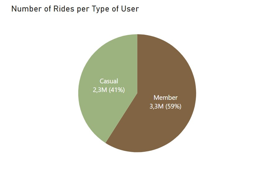
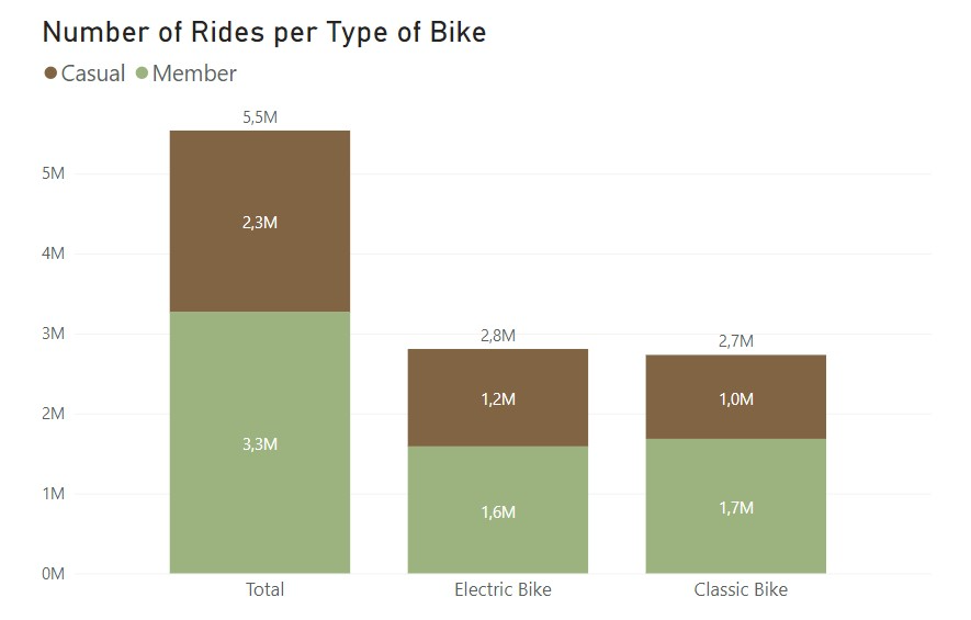
With these, we know that the majority of rides were made by annual members with 59% of total rides. Regarding the bike choice, the electric bikes are the ones used the most but only slightly more than classic bikes. Curious to see that casual members prefer electric bikes but annual members used classic bikes more often. The values are not that far appart so I’m not sure if there is anything of relevance here.
I then decided to compare the total number of rides per month. This resulted in the following:
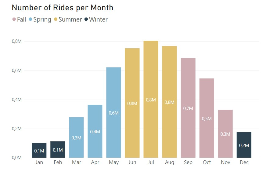

Just by looking at these two charts, we can already tell quite a bit about the preferences of these bike rides. From the bar chart, it’s clear that there is a preference in riding bikes in the late spring, summer and early fall, definitly caused by the nice weather. From the line chart, we see that the number of rides per month is pretty identical in terms of trend, as expected from the previous chart. The only difference is that the casual riders barely ride in the winter times, while the difference for the annual members is not so drastic.
To get more details, let’s look at the same charts but with a daily time-frame:
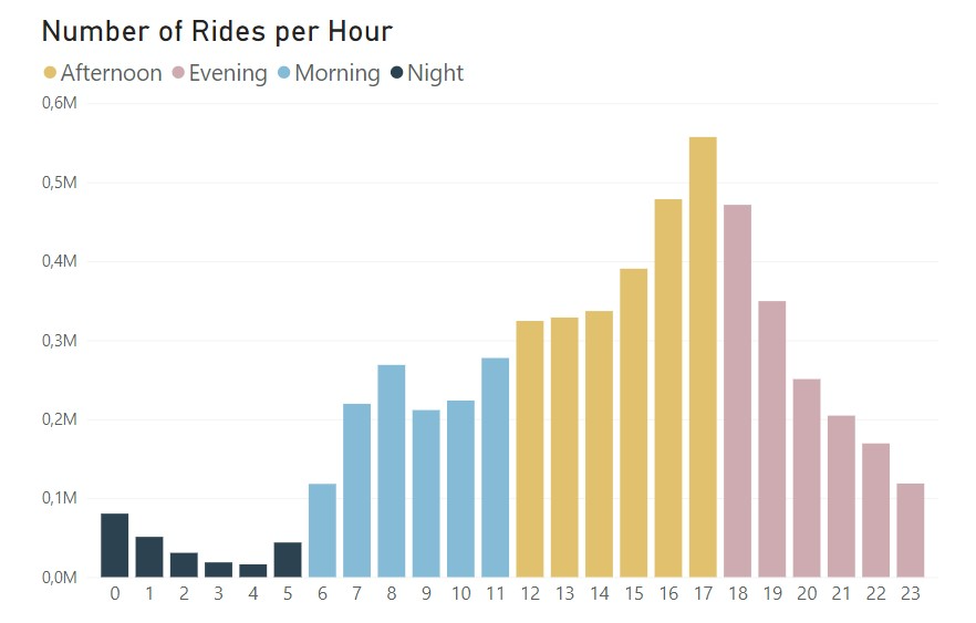
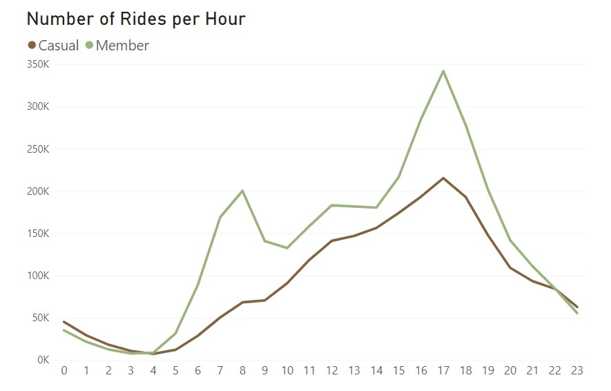
With this time-frame, we get more possible insights. From the bar chart, as expected, there are not that many rides during the night and then there is a pretty steady rise that starts at 6 am and peaks in the late afternoon and early evening. From the line chart, the casual riders follow the trend we had in the bar chart, rising slightly during the day and peaking late afternoon, but the annual members, appart from the similar trend, have two clear peaks, one around 8 am and another around 5 pm. These seem to indicate that the annual members are using the bikes to ride to and from work, which would be a good explanation to have a annual pass.
To try and get more information on this behalf, I plotted the data for a weekly time frame:
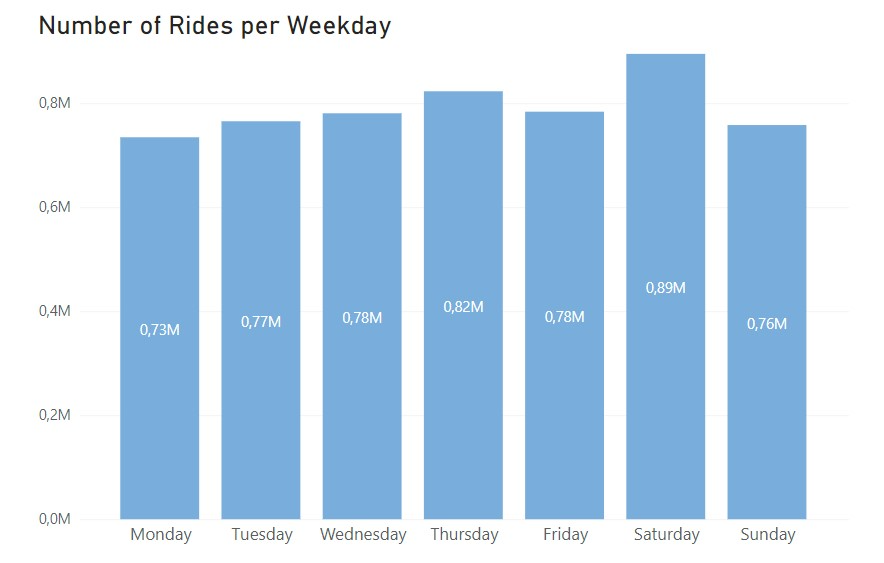
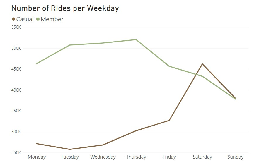
The bar chart shows that, overall, the number of rides during the week is quite constant, peaking only a bit on Saturdays. From the line chart we get that casual riders have a clear preference for the weekends and annual riders actually ride more during the week. This information supports the idea that annual members use the bikes for work purposes, while casual riders are likely riding only in their free time which would take place mostly on weekends.
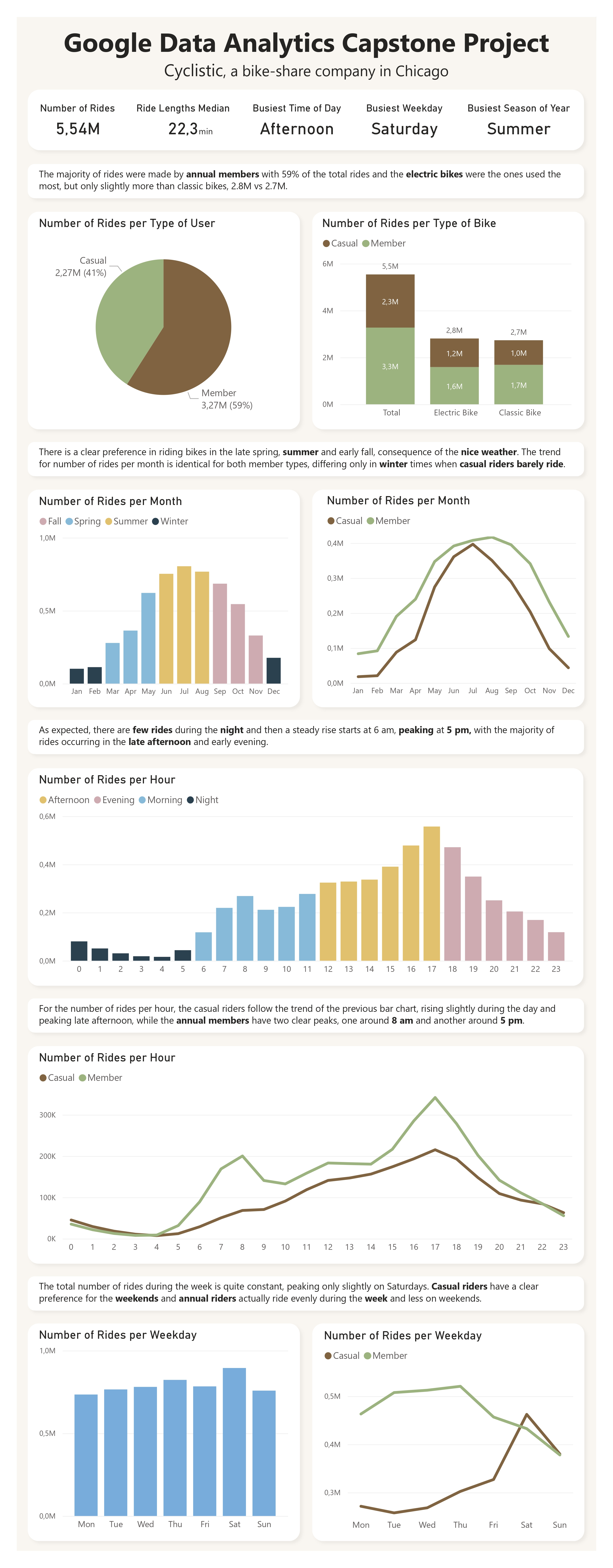
Finally, for the final dashboard, since it was the first time I made one, I used the same outline as the one in the previous blog I mentioned:
Step 6 - Act
From the previous step, we concluded that annual members are using the Cyclistic membership to commute to and from work. The casual riders, on the other hand, have a pattern of using the bikes more on the weekends and during nice weather seasons which indicates that they are probably living in Chicago but have other ways to commute to work or they are tourists visiting the city, which could explain most of the week rides.
I consider that this was not an exhaustive analysis to the differences between casual and annual members, mainly due to the limited information we had about the customers. But, based on these findings, according to the customers preferences and riding patterns, the first solution would be to create a subscription that offers unlimited access to Cyclist bikes during weekends. For this subscription, the company could consider two timelines, one for the full year, for customers that like to ride the whole year, and then another just for the summer period (or a set of 3 to 6 months around that season), which would be more appropriate for the customers that prefer to ride when the weather is better.
That’s it for the Google Data Analytics course from Coursera. If you want, you can read my notes on the different modules (first, second, third, fourth, fifth, sixth and eight) of the course here on the website, or on my Medium page. I also intend to write some more posts on other courses I took (SQL and Python so far), some detailed notes I took (and continue to take) from subjects like data visualisation and probably some short book summaries of my favourite books, with the best quotes and key concepts.
As I mentioned in the beginning, this is mainly with the goal of consolidating all topics I’m interested in learning and also having all of it well structured and put together in one place (this website). So if you find this kind of content useful and wish to read some more, you can follow me on Medium just so you know whenever I post more stuff.


